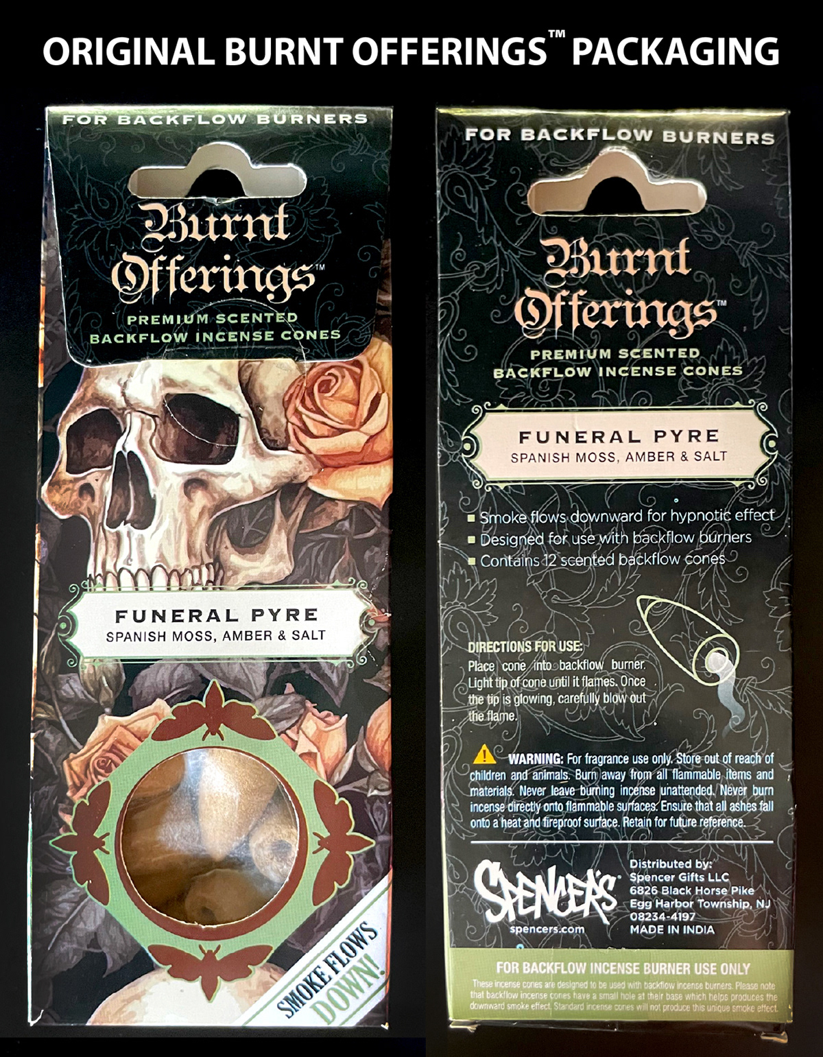
This began as an exploration: I wanted to imagine how the Burnt Offerings™ packaging might look if it were redesigned to fit the current Spencer’s incense style guide.
In the process, I realized that the existing incense packaging for backflow incense cones lacked key information about the product’s Unique Selling Point. It assumes the customer already knows how backflow cones are different from regular cones and that they’ll understand they need one of the nearby backflow burners to experience the intended effect. Neither is guaranteed, especially for first-time incense buyers.
In the process, I realized that the existing incense packaging for backflow incense cones lacked key information about the product’s Unique Selling Point. It assumes the customer already knows how backflow cones are different from regular cones and that they’ll understand they need one of the nearby backflow burners to experience the intended effect. Neither is guaranteed, especially for first-time incense buyers.
With that in mind, I made targeted updates to both the visual design and copy to call attention to this product’s unique features and support a stronger user experience.
KEY CHANGES:
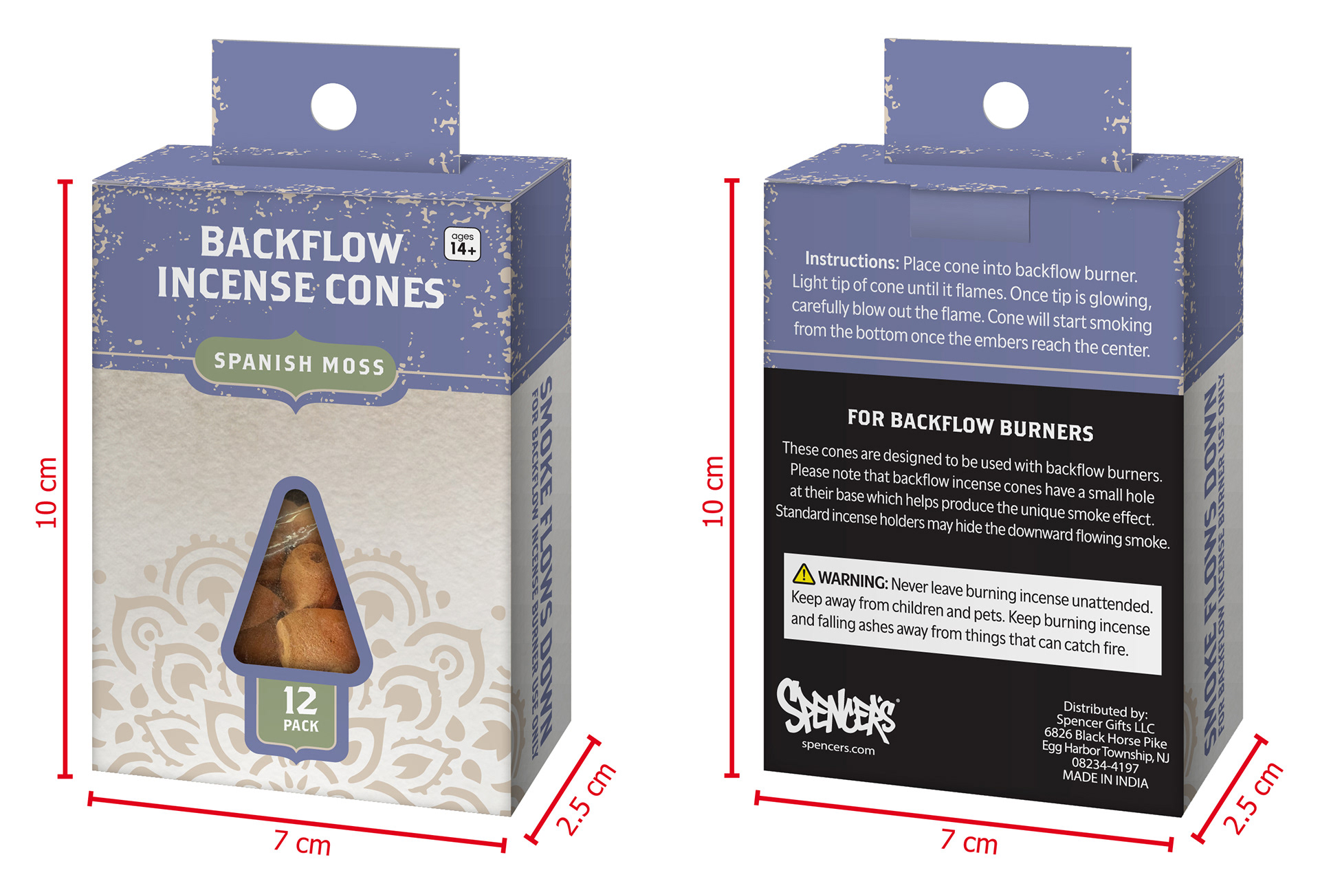
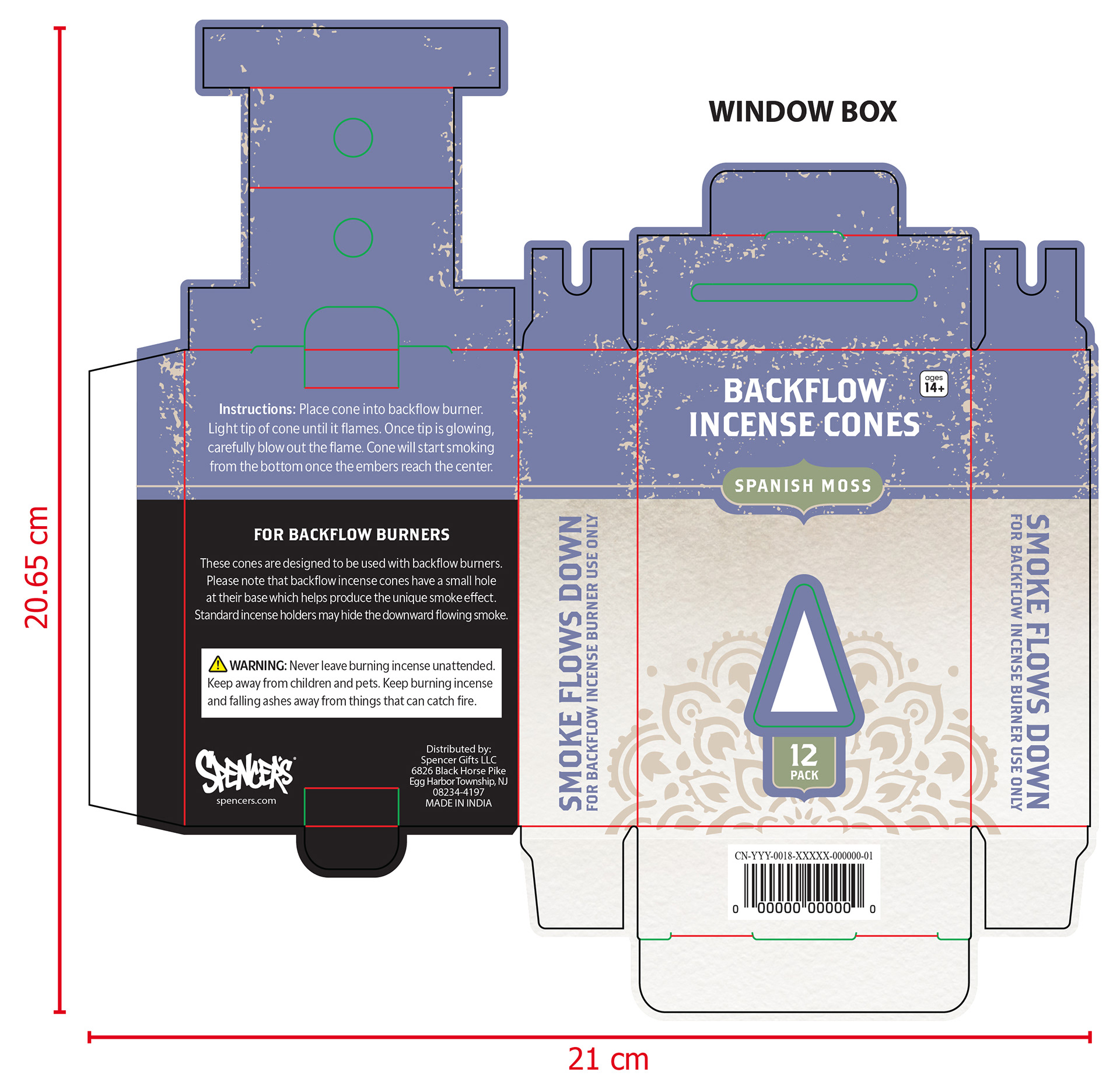
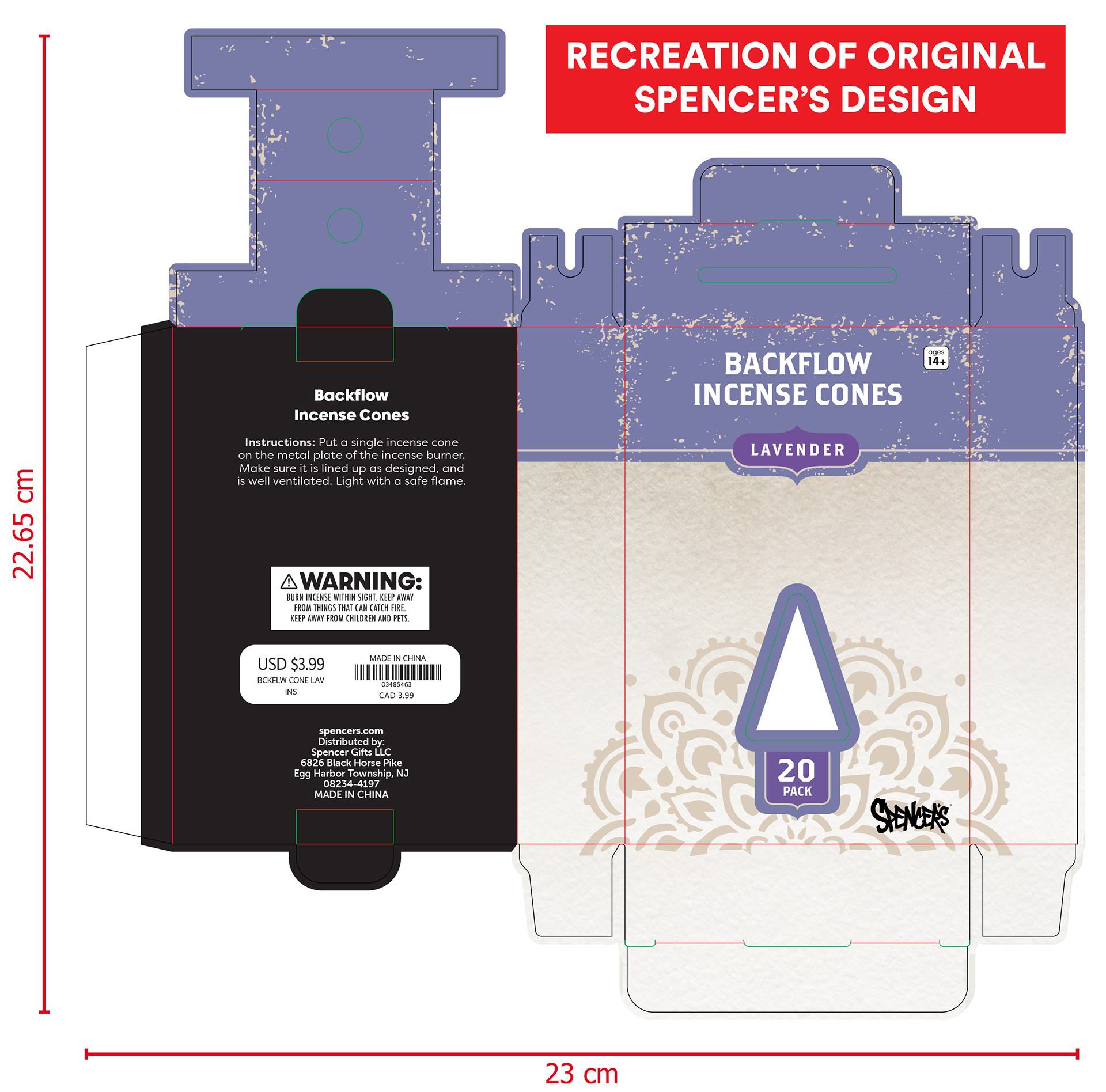
• Reduced overall box size, since Burnt Offerings™ cones come in a 12-pack.
• Updated scent variation and item count.
• Used side panels to highlight the key product difference (downward smoke flow) that sets these cones apart and justifies their higher price point.
• Rewrote the instructions to more clearly explain how to use the cones, taking into consideration the user experience for a newbie (i.e. its not enough to light the incense, you have to blow it out too + the smoke effect takes a few minutes to appear).
• Extended the lavender header onto the
back panel for a less jarring visual transition.
• Added new messaging emphasizing the need for a backflow-specific burner to achieve the full effect; Potentially driving sales for the burners merchandised directly below these cones in stores.
• Revised the “Warning” copy to strike a balance between the more detailed Burnt Offerings™ style and the minimal Spencer’s version. It’s now more informative, while still keeping things brief.
• Moved the Spencer’s logo to the back of the box for a cleaner look.
• Updated country of origin to reflect that
Burnt Offerings™ incense is made in India.
• Replaced the barcode label with a directly
printed code for a more streamlined finish.
KEY CHANGES:
• Reduced overall box size, since Burnt Offerings™ cones come in a 12-pack.
• Updated scent variation and item count.
• Used side panels to highlight the key product difference (downward smoke flow) that sets these cones apart and justifies their higher price point.
• Rewrote the instructions to more clearly explain how to use the cones, taking into consideration the user experience for a newbie (i.e. its not enough to light the incense, you have to blow it out too + the smoke effect takes a few minutes to appear).
• Extended the lavender header onto the
back panel for a less jarring visual transition.
• Added new messaging emphasizing the need for a backflow-specific burner to achieve the full effect; Potentially driving sales for the burners merchandised directly below these cones in stores.
• Revised the “Warning” copy to strike a balance between the more detailed Burnt Offerings™ style and the minimal Spencer’s version. It’s now more informative, while still keeping things brief.
• Moved the Spencer’s logo to the back of the box for a cleaner look.
• Updated country of origin to reflect that
Burnt Offerings™ incense is made in India.
• Replaced the barcode label with a directly
printed code for a more streamlined finish.